Create Heatmap from Tabular Data
Heatmaps are a way to visualize data using color. This example shows how to import a file into MATLAB® as a table and create a heatmap from the table columns. It also shows how to modify the appearance of the heatmap, such as setting the title and axis labels.
Import File as Table
Load the sample fileTemperatureData.csv, which contains average daily temperatures from January 2015 through July 2016. Read the file into a table and display the first five rows.
tbl = readtable('TemperatureData.csv'); head(tbl,5)
ans=5×4 tableYear Month Day TemperatureF ____ ___________ ___ ____________ 2015 {'January'} 1 23 2015 {'January'} 2 31 2015 {'January'} 3 25 2015 {'January'} 4 39 2015 {'January'} 5 29
Create Basic Heatmap
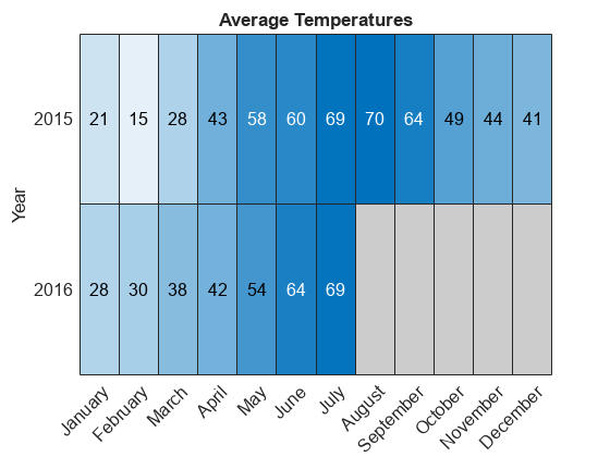
Create a heatmap that shows the months along thex-axis and years along they-axis. Color the heatmap cells using the temperature data by setting theColorVariableproperty. Assign theHeatmapChartobject to the variableh. Usehto modify the chart after it is created.
h = heatmap(tbl,'Month',“年”,'ColorVariable','TemperatureF');
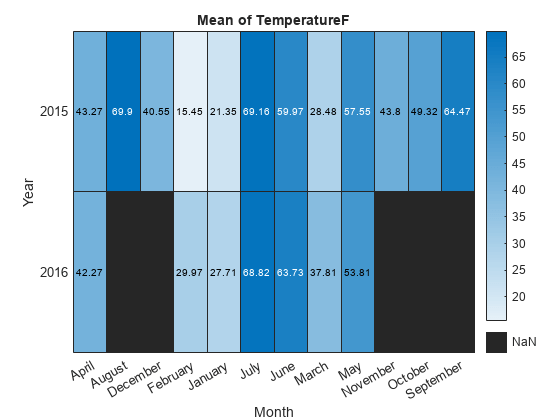
By default, MATLAB calculates the color data as the average temperature for each month. However, you can change the calculation method by setting theColorMethodproperty.
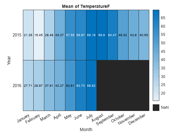
Reorder Values Along Axis
The values along an axis appear in alphabetical order. Reorder the months so that they appear in chronological order. You can customize the labels using categorical arrays or by settingHeatmapChartproperties.
To use categorical arrays, first change the data in theMonthcolumn of the table from a cell array to a categorical array. Then use thereordercatsfunction to reorder the categories. You can apply these functions to the table in the workspace (tbl) or to the table stored in theSourceTableproperty of theHeatmapChartobject (h.SourceTable). Applying them to the table stored in theHeatmapChartobject avoids affecting the original data.
h.SourceTable.Month = categorical(h.SourceTable.Month); neworder = {'January','February','March','April','May','June','July',...'August','September','October','November','December'}; h.SourceTable.Month = reordercats(h.SourceTable.Month,neworder);
Similarly, you can add, remove, or rename the heatmap labels using theaddcats,removecats, orrenamecatsfunctions for categorical arrays.
Alternatively, you can reorder the values along an axis using theXDisplayDataandYDisplayDataproperties of theHeatmapChartobject.
h.XDisplayData = {'January','February','March','April','May','June','July',...'August','September','October','November','December'};

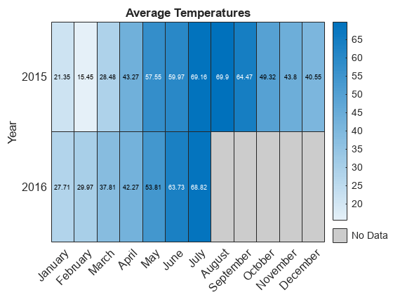
Modify Title and Axis Labels
When you create a heatmap using tabular data, the heatmap automatically generates a title and axis labels. Customize the title and axis labels by setting theTitle,XLabel, andYLabelproperties of theHeatmapChartobject. For example, change the title and remove thex-axis label. Also, change the font size.
h.Title ='Average Temperatures'; h.XLabel =''; h.FontSize = 12;

Modify Appearance of Missing Data Cells
Since there is no data for August 2016 through December 2016, those cells appear as missing data. Modify the appearance of the missing data cells using theMissingDataColorandMissingDataLabelproperties.
h.MissingDataColor = [0.8 0.8 0.8]; h.MissingDataLabel ='No Data';
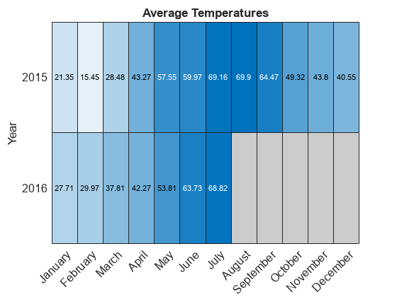
删除Colorbar
Remove the colorbar by setting theColorbarVisibleproperty.
h.ColorbarVisible ='off';
Format Cell Text
Customize the format of the text that appears in each cell by setting theCellLabelFormatproperty. For example, display the text with no decimal values.
h.CellLabelFormat ='%.0f';
Add or Remove Values Along Axis
Show only the first month of each quarter by setting theXDisplayDataproperty. Add the year 2017 along they-axis by setting theYDisplayDataproperty. Set these properties to a subset, superset, or permutation of the values inXDataorYData, respectively.
h.XDisplayData = {'January','April','July','October'}; h.YDisplayData = {'2015','2016','2017'};
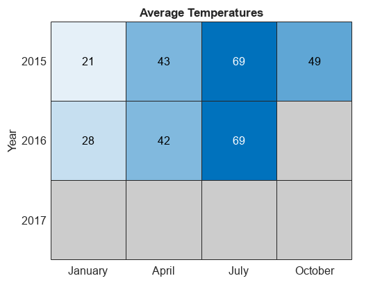
Since there is no data associated with the year 2017, the heatmap cells use the missing data color.
See Also
Functions
Properties
Select a Web Site
Choose a web site to get translated content where available and see local events and offers. Based on your location, we recommend that you select:.
Selectweb siteYou can also select a web site from the following list:
Americas
- América Latina(Español)
- Canada(English)
- United States(English)
Europe
- Belgium(English)
- Denmark(English)
- Deutschland(Deutsch)
- España(Español)
- Finland(English)
- France(Français)
- Ireland(English)
- 意大利(Italiano)
- Luxembourg(English)
- Netherlands(English)
- Norway(English)
- Österreich(Deutsch)
- Portugal(English)
- Sweden(English)
- 瑞士
- United Kingdom(English)
