ensemble2bnd文档
的ensemble2bnd函数计算跨数据集集成的统计信息,并提供几个选项来绘制这些集成统计信息。
在这种情况下,我们使用“集合”来指代使用相同自变量坐标的矢量数据集的任何集合。综合数据在气候科学中很常见;模型研究通常使用模型内集成来包含初始条件或参数的不确定性,并使用模型间集成来进一步包含模型过程中的结构不确定性。时间序列数据也是这种类型分析的主要候选者,因为我们经常希望查看年际变化。
函数ensemble2bnd最初是为了将集成数据提供给boundedline函数,并且已经扩展到允许多个选项来绘制这些类型数据集的平均值、中位数、四分位数、上/下界等。
内容
语法
A = ensemble2bnd(x,y) [A, h] = ensemble2bnd(x,y, 'plot', plottype)[…]=…, 'dims', dims)[…]=…,“中间”,中间)[...] = ensemble2bnd(..., 'prc', prc) [...] = ensemble2bnd(..., 'alpha', alphaval) [...] = ensemble2bnd(..., 'tlim', tlim) [...] = ensemble2bnd(..., 'cmap', colors) [...] = ensemble2bnd(..., 'axis', hax) [...] = ensemble2bnd(..., 'whisker', w)
描述
[A, h] = ensemble2bnd(x,y)在每个x坐标处计算y的均值和上/下界。x数据应该是一个矢量数组,y是一个nx x ny x nens数组,其中nx对应x维点的数量(即x输入的长度),ny对应不同数据集的数量,nens是每个数据集中集合成员的数量。(参见'dims'参数来调整这些维度)
[A, h] = ensemble2bnd(x,y, 'plot', plottype)将数据集绘制为带阴影补丁的行('boundedline')、带errorbar的行('errorbar')、带errorbars的未堆叠条形图('bar')或箱形图('boxplot')。默认值为'none',表示不创建任何图。
ensemble2bnd(…, 'dims', dims)允许输入矩阵y通过一个由字母x、y和e组成的3个字母字符串进行排列,这些字母表示输入矩阵中的哪个维度分别对应于独立坐标、不同的数据集和每个数据集的集合。默认值是'xye'。
ensemble2bnd(…,'center', center)在每个数据集的“平均值”(默认值)和“中位数”之间切换中心线统计数据。
ensemble2bnd(…, 'prc', prc)指定与下界和上界对应的百分比值。这些应该是成对的,从最低到最高的百分比。缺省值是[0 100]。
ensemble2bnd(…, 'alpha', true)指示应使用透明修补程序而不是不透明修补程序绘制有界修补程序。
ensemble2bnd(…, 'tlim', tlim)更改与补丁相关的颜色限制或与百分位数相关的错误条。默认情况下,中心线/条/点用指定的颜色绘制(饱和度= 1),边界对象的颜色(patch, errorbars等)使用较浅的颜色版本,随着边界的扩大而变浅(默认限制是[0.1 0.5])。
ensemble2bnd(…,'cmap', colors)为绘制的数据集提供另一种颜色顺序。
ensemble2bnd(…, '轴',hax)将任何图形添加到指定的轴而不是当前轴。
ensemble2bnd(…, 'whisker', w)更改用于箱线图计算离群值的须长因子(仅限箱线图选项)。
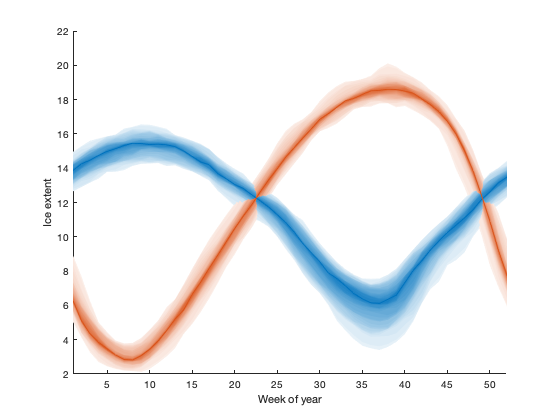
例如:海冰年际变化
在我们的例子中,我们将使用海冰范围时间序列作为我们的集合数据。我们首先将两个时间序列重新塑造为每年x年的时间矩阵reshapetimeseries,并将这些连接起来。前期数据以两天为间隔,后期数据以日为间隔;我们将每周对数据进行bin,以避免任何来自此更改的工件:
负载seaice_extent.maticeN = reshapetimesseries (t, extent_N,“本”52);iceS = reshapetimesseries (t, extent_S,“本”52);ice = cat(3, iceN, iceS);
默认情况下,该函数计算数据中每个x位置的平均值和上/下界。我们可以画出来有界行:
[A, h] = ensemble ble2bnd(1:52,ice,“暗”,“xey”,“阴谋”,“boundedline”甘氨胆酸)组(,“xlim”, [1 52]);包含(“一年中的一周”);ylabel (“冰程度”);
A = struct with fields: cent: [52×2 double] bndlo: [52×2 double] bndhi: [52×2 double] errlo: [52×2 double] errhi: [52×2 double] h = struct with fields: ln: [1×2 Line] patch: [1×2 patch]

带错误条的线形图:
cla [A, h] = ensemble2bnd(1:52,ice;“暗”,“xey”,“阴谋”,“errorbar”)
A = struct with fields: cent: [52×2 double] bndlo: [52×2 double] bndhi: [52×2 double] errlo: [52×2 double] errhi: [52×2 double] h = struct with fields: ln: [2×1 Line] errbar: [1×2 ErrorBar]

或者带errorbar的条形图:
cla [A,h] = ensemble2bnd(1:52, ice;“暗”,“xey”,“阴谋”,“酒吧”)设置(h.bar“edgecolor”,“没有”);
A = struct with fields: cent: [52×2 double] bndlo: [52×2 double] bndhi: [52×2 double] errlo: [52×2 double] errhi: [52×2 double] h = struct with fields: bar: [1×2 bar] errbar: [1×2 ErrorBar]

注意,句柄输出结构中的字段名称会根据所选的绘图选项而变化。
我们还可以增加显示的间隔数。例如,您可能希望看到四分位数范围以及最小值和最大值。在这种情况下,使用中位数作为中线而不是平均值可能更有意义:
cla ensemble2bnd(1:52冰,“暗”,“xey”,“阴谋”,“boundedline”,...“分”,“中值”,“中华人民共和国”, [0 25 75 100]);

如果添加大量均匀间隔的百分位数,则可以模拟阴影分布图。
Cla [~,h] = ensemble2bnd(1:52,ice,“暗”,“xey”,“阴谋”,“boundedline”,...“分”,“中值”,“中华人民共和国”, [0:2:48 52:2:100],“tlim”, [0.1 0.9]);
补丁对象的绘制顺序从外部边界移动到内部边界,这就是导致线重叠的交错外观的原因,但你可以通过一点重叠来修复这个问题:
uistack (h.patch(结束:1:1,2),“高级”);

作为使用不同颜色的不透明边界的替代方法,您可以使用透明补丁绘制边界。当使用透明补丁时,将透明度限制设置为单个值通常是有意义的,因为重叠的补丁将自动显示附加颜色:
Cla [~,h] = ensemble2bnd(1:52,ice,“暗”,“xey”,“阴谋”,“boundedline”,...“分”,“中值”,“中华人民共和国”, [0 25 75 100],“tlim”, [0.2 0.2],...“α”,真正的);

箱线图绘图选项的工作方式与其他选项略有不同,因为您不能指定绘图的确切百分位数界限。相反,此选项使用通常的箱线图统计信息(注意,此选项需要使用统计工具箱,因为它使用该工具箱中的箱线图函数)。像条形图选项一样,这个版本将数据集并排放置,以避免太多重叠。
boxplot函数返回的图形句柄是…至少可以说,这是不合直觉的。如果你想改变或编辑属性,我建议使用标签:
cla [A,h] = ensemble2bnd(1:52,ice;“暗”,“xey”,“阴谋”,的箱线图)设置(findall (h.box,“标签”,“上须”),“线型”,“- - -”);集(findall (h.box“标签”,降低晶须的),“线型”,“- - -”);
A = struct with fields: cent: [52×2 double] bndlo: [52×2×2 double] bndhi: [52×2×2 double] errlo: [52×2×2 double] errhi: [52×2×2 double] h = struct with fields: box: [7×2×52 double]

作者信息
的ensemble2bnd函数及其支持文档由万博1manbetx凯利·a·科尔尼华盛顿大学教授。的ensemble2bnd函数是Matlab气候数据工具箱的一部分。