使用诊断特征设计者应用程序的特征提取
Melda Ulusoy, MathWorks
使用诊断功能设计师应用程序提取时间域和频谱特征从您的数据,以设计预测性维护算法。
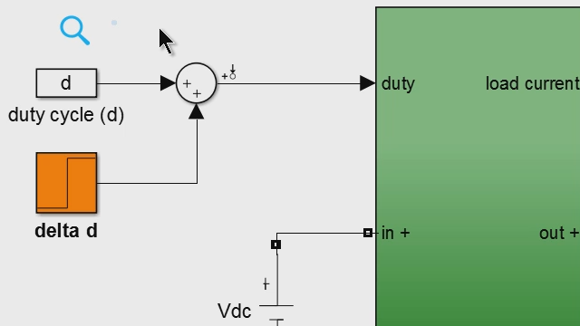
在本例中,测量数据是从一个三缸泵在不同故障条件下收集的。该应用程序允许您导入数据并交互式地可视化它。可以根据不同的故障情况对测量结果进行分组。从数据中提取时域和频谱特征后,可以使用直方图来评估提取特征的有效性。您还可以对它们进行排序,以确定哪些特征可能最好地区分健康行为和错误行为。最后,将最有效的特征导出到Classification Learner app,用于进一步评估特征有效性和训练机器学习模型。
使用诊断特征设计器应用程序提取功能
在这段视频中,我们将演示如何使用诊断特征设计应用程序来提取特征,以开发预测性维护算法。
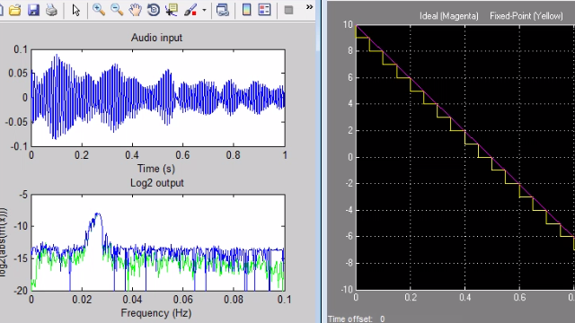
我们首先导入我们的数据设置到应用程序中。在不同的故障条件下从三重泵收集数据。它存储在一个专业数据存储器中,用于开发预测维护算法。集合数据存储包含1.2秒的流量和压力测量,以及每个测量的故障码。导入数据集后,它会在数据浏览器中显示。要可视化流量信号,我们选择它并单击“信号迹线”。这绘制了具有不同故障条件的所有测量。我们现在可以通过选择此选项来通过故障代码进行测量。如果我们放大使用下面的Panner条带,我们可以更好地了解如何根据不同的故障类型使用不同颜色突出显示测量值。接下来,我们将从此数据中提取时间域和光谱功能。 We go back to the Feature Designer tab, and under this menu, we select signal features to generate statistics features. We’ll first use the flow data and later extract features from the pressure signal. Here, we have commonly used time-domain features such as the mean, standard deviation, kurtosis, and skewness. Now that we computed the time-domain features, we’ll continue with extracting spectral features. The app can use the time-domain data to estimate the signal spectra of these signals which can be then used to extract spectral features. We select spectral estimation and click power spectrum. Here, you can try out nonparametric or parametric methods to compute the spectrum and compare their results. We choose the auto-regressive model with a model order of 20. Next, to compute spectral features, we click here. We select the frequency band such that it includes the first four peaks. The reason is that due to noisy data at higher frequencies, it’s harder to distinguish the spectral peaks. Therefore, any features extracted from higher frequencies won’t contribute to the performance of machine learning models.
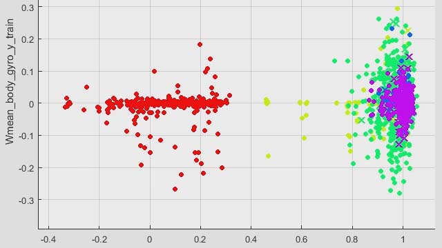
到目前为止,我们确定了流量数据的时间和光谱特征。您可以使用压力数据重复相同的进程并提取一些附加功能。现在,来自流量和压力数据的所有提取特征存储在FeatureTable1中。选择此表后,我们可以单击显示表单中的所有计算功能值的功能表视图。不同的列上显示不同的功能。我们还可以使用直方图,该直方图显示所计算的功能的分布。在这些绘图上,不同的颜色表示不同的故障。由于不同故障类型的重叠分布和大量的功能,很难确定哪些功能更可分离和独特。该应用程序允许我们对所有功能进行排名以识别有效地分离不同类型的故障的功能。在“功能设计器”选项卡上,当我们单击“排位功能”时,应用程序使用单向ANOVA来计算所有功能的排名分数。 The results of the ANOVA test are displayed on the right-hand side, whereas the bars on the left shows the normalized scores for different features. We can view the feature names by hovering over the bars. The features with a higher score are good candidates for training a machine learning model. For further evaluation of the extracted features, we can now export them to the Classification Learner, where we can train machine learning models for fault classification.
产品焦点
其他资源
相关视频和网络研讨会


你也可以从以下列表中选择一个网站: